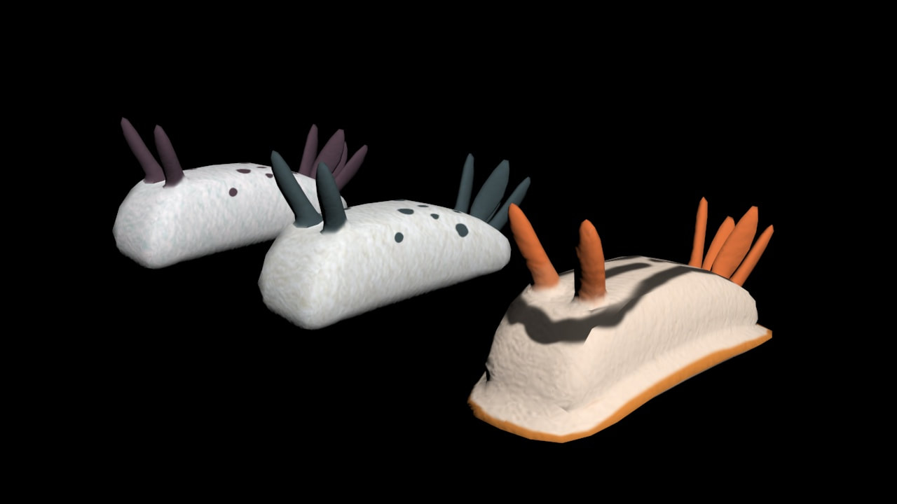
Independent Project: Sea Slug Plushies, 3ds Max 2024, 3/8/2024
|
These sea slugs are part of a larger independent project.
I wanted to make sea slugs that looked like they were plush toys, which I accomplished with my new understanding of UVW maps and the Material Editor. I created two versions of a simpler sea slug, and then a more complicated version with the frill sea slugs are known to have. I really enjoyed working on this and in addition to gaining more experience working with unwrapping UVWs I also gained a better understanding of how bump maps work and what intensity to use when working with them. |
UVW Unwrapping, 3ds Max 2024, 2/8/2024
|
I begun this project by watching multiple tutorials on unwrapping UVs, one of which was assigned by my teacher. In this project I enjoyed painting the UV map, which was also the easiest part of this project for me. The hardest part of this assignment for me was making sure that I had painted every section of the model. Because this is a model that I created in the beginning of the year, there are many irregularities and uneven segments that made it easy to miss small slivers of the model that weren't painted the correct color. Through this skill I can now heighten my models, while also having a better understanding of materials in general when modeling.
|
Vector Pixel Art, Adobe Illustrate, 3/21/2024
|
|
For this assignment I used a preexisting character that I had created to be a possible character in a game I thought up. Since the character was already meant to be in a simple 2D game, adjusting the design to work in a pixelated form was very easy.
I actually used two layers for this as I do when drawing in other programs so that I could create a rough sketch for an outline, and then work on top of that for the actual piece. Once I had the final outline created and filled in with a base color I began working on adding other flat colors, such as the belly and spots. After I finished this I began working on shading after establishing where I wanted the light source would be. I made the arm and leg that were behind the body entirely shaded to give the character more depth and then went over any areas that would have shadows. I also added a few accessories that were in the initial outline to not only better establish the character themself, but to allow them to stand out among any others. I really enjoy character design and pixel art has always been something that I've been interested in but never something I was able to do. |
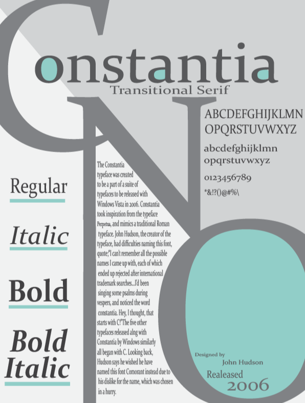
Type Specimen, Adobe Illustrator, 2/23/2024
|
For this activity, I created a type specimen, which is a demonstration of a specific typeface. I choose to use Constantia because I liked the look of its sharp and squared off serifs. I included demonstrations of not only how letters, numbers, and special characters looked in this typeface, but also displayed the main fonts included in it, such as Italic or Bold fonts. I also included some of the history of this typeface from when it was created and later released in 2006. Because this font is a Serif font, I would not use it for anything printed, and therefore, despite this specimen being created in Illustrator, I won't likely use it again due to Illustrator mainly being used for the design of posters, flyers, etc. that will be physically printed.
|
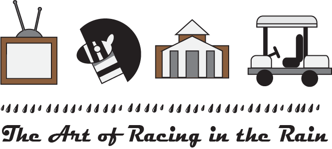
The Four Icon Challenge, Adobe Illustrator, 2/29/2024
|
The Four Icon Challenge is a project created by Kyle Tezak, a graphic designer located in Chicago. The challenge is to summarize a book using only four icons. I chose to represent the book The Art of Racing in the Rain by Garth Stein.
I created my icons using the shape tools and the shape builder to create something that is visually interesting and cohesive. The hardest icon for me to make ended up being the zebra, which I suspect is because animals are organic shapes, and so its more difficult to recreate them, even as a simplified version. I feel that this challenge allowed me to experiment more with the shape builder tool, and that I now have a better understanding of how it works and its different effects. I learned very quickly to take away different layers of the icons when using the shape builder to trim other shape or else everything that overlapped would be deleted. |
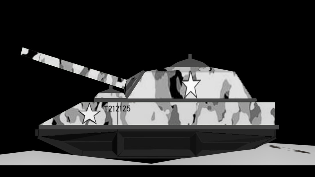
Menu, Adobe Illustrator,
|
This scene was an improvement upon my previous model of a vending machine. While my previous attempt at modeling a vending machine had a more cartoonish style due to the colors and lack of materials, this scene ended up more gritty, with it's style and lighting belonging more to a more realistic feel.
While the modeling portion of this project was still very basic, I enjoyed creating multiple pieces and arranging them in a cohesive scene. During the creation of this scene I taught myself a basic understanding of materials, and also reviewed animating light sources. The materials used were largely preset, such as the brick and metallic textures, but I experimented with and altered these preset options a lot to get the right colors, textures, emission levels, and so on. I am very proud of how cohesive this scene was, and how I have grown in terms of skills with 3D modeling. |
