|
This design was for a project exploring color harmonies. The three harmonies I used were monochromatic, complimentary, and analogous color schemes. Each color schemes affected the feel of the character I used, that being Sailor Moon. Even with the use of bright colors the monochromatic and analogous designs are more subtle than the complimentary color scheme, which makes the character stand out more due to the contrasting colors. This was done with the help of adobe color palates and blend modes. I also learned about how to resize the canvas itself rather than the images on it. 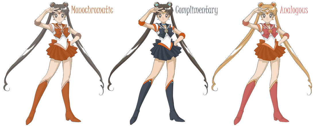
0 Comments
|
