|
For this assignment I decided to make a mock art exhibition poster showcasing Waterfall, a lithograph by M.C. Escher. I chose this piece because Escher's works feature unique shapes. I chose to do one of his architectural pieces instead of a tessellation. While I am very proud of the final project I found this to be a long and tedious project, partially because of the work I chose to trace. While I feel that this exercise cemented by understanding of how to use the pen tool in Adobe Illustrator, should I have done this project again I would have chosen a simpler piece. For the font on the poster itself I chose to use a sans serif font to match the rectangular architecture of the piece. 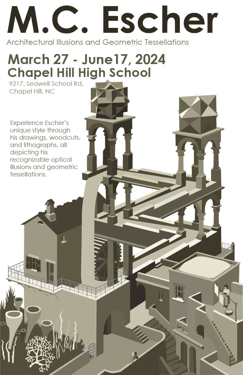
0 Comments
This quarter focused largely on creating 2D art with Adobe Illustrator. While I have previously worked with digital drawing programs, I have not had previous experience with Illustrator. I learned how to use multiple tools such as the shape builder and pen tool to create vector graphics. I also learned design principles and techniques, as well has how and when to use text and types of fonts. Though my assigned work this quarter is very basic, I now have a better understanding of vector graphics the the tools used to create them. My favorite feature in Adobe Illustrate is the ability to create pixel art. In addition to digital art I also learned how to unwrap and paint UVWs for 3D models in 3ds Max. I really enjoyed being able to heighten my 3D models and make them more detailed and stylized. 3D modeling continues to be my favorite medium I've worked in in this class, but I also really enjoyed creating pixel art in Adobe Illustrate. Pre-ProductionFor this assignment I used a preexisting character that I had created to be a possible character in a game I thought up. Since the character was already meant to be in a simple 2D game, adjusting the design to work in a pixelated form was very easy. 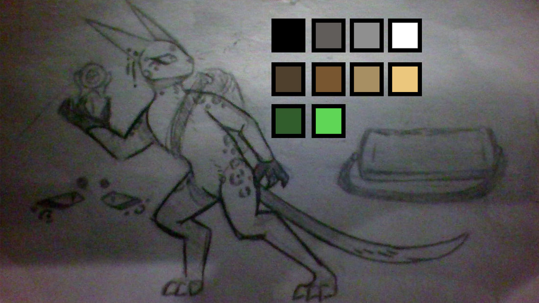 ProductionTo produce this character I began with a tutorial that taught me how to use grids and live painting in Adobe Illustrator. I actually used two layers for this as I do when drawing in other programs so that I could create a rough sketch for an outline, and then work on top of that for the actual piece. Once I had the final outline created and filled in with a base color I began working on adding other flat colors, such as the belly and spots. After I finished this I began working on shading after establishing where I wanted the light source would be. I made the arm and leg that were behind the body entirely shaded to give the character more depth and then went over any areas that would have shadows. I also added a few accessories that were in the initial outline to not only better establish the character themself, but to allow them to stand out among any others. Post-ProductionI scaled my 500 x 500 pixel image to 128 x 128 and 64 x 64 pixel art boards to make sure that it was scalable and that the design would still be cohesive in a smaller more realistic form. ReflectionOut of all the things I've done in Adobe Illustrator this quarter, creating pixel art has definitely been my favorite. I really enjoy character design and pixel art has always been something that I've been interested in but something I wasn't able to do. The one thing I would change about the pixel art of my character is the shape it their face, but I am very happy with their pose and shading. While working in Illustrator is very different from Photoshop I appreciate the ability of vector graphics to scale, especially when creating art that could be used in games. These sea slugs are part of a larger independent project, I wanted to make sea slugs that looked like they were plush toys, which I accomplished with my new understanding of UVW maps and the Material Editor. I created two versions of a simpler sea slug, and then a more complicated version with the frill sea slugs are known to have. I really enjoyed working on this and in addition to gaining more experience working with unwrapping UVWs I also gained a better understanding of how bump maps work and what intensity to use when working with them. In this assignment I was told to trace logos using the Pen Tool to help solidify my understanding of understanding of how to use it. I tried to choose logos with both curves and straight lines, as well as logos that have separate pieces to them to show the different ways to use the pen tool as well as different levels of complexity. I found the large curves to be the most difficult to do. I liked layering different shapes to create different effects while allowing me to do things such as having a simple circle as a bottom layer to fill in certain areas easier. 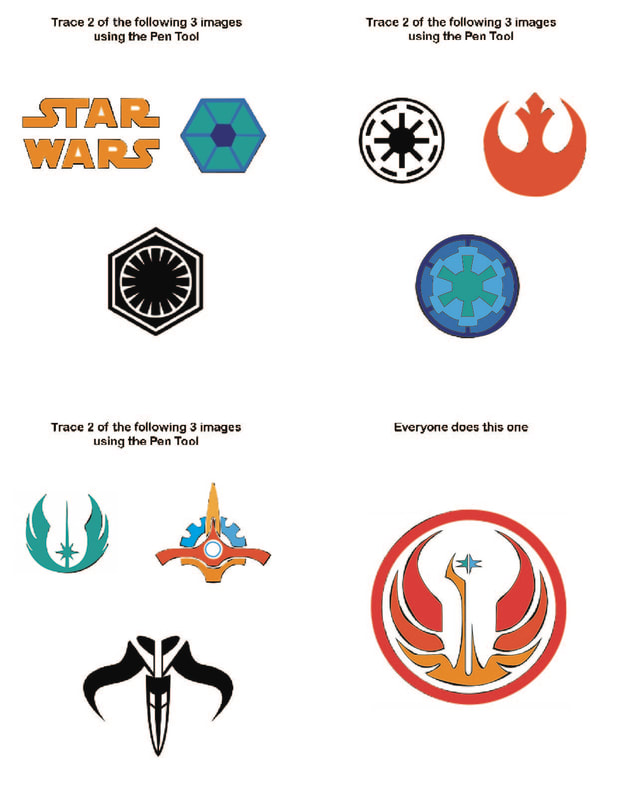 The Bezier Game was my introduction to the Pen Tool in Adobe Illustrator. I messed around with this tool and the Curvature Tool previously in my free time, but this was my first time really learning how it works and what it can create. This certainly isn't my favorite tool, but I feel that I now have a general understanding of how it works. This game taught me basic keyboard shortcuts, and the chosen shapes allowed me to figure out how much or little I can curve a line, and how to change the way it curves. 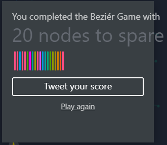 |
