|
The Bezier Game was my introduction to the Pen Tool in Adobe Illustrator. I messed around with this tool and the Curvature Tool previously in my free time, but this was my first time really learning how it works and what it can create. This certainly isn't my favorite tool, but I feel that I now have a general understanding of how it works. This game taught me basic keyboard shortcuts, and the chosen shapes allowed me to figure out how much or little I can curve a line, and how to change the way it curves. 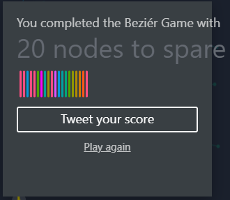
0 Comments
The Four Icon Challenge is a project created by Kyle Tezak, a graphic designer located in Chicago. The challenge is to summarize a book using only four icons. I chose to represent the book The Art of Racing in the Rain by Garth Stein. I created my icons using the shape tools and the shape builder to create something that is visually interesting and cohesive. The hardest icon for me to make ended up being the zebra, which I suspect is because animals are organic shapes, and so its more difficult to recreate them, even as a simplified version. I feel that this challenge allowed me to experiment more with the shape builder tool, and that I now have a better understanding of how it works and its different effects. I learned very quickly to take away different layers of the icons when using the shape builder to trim other shape or else everything that overlapped would be deleted. 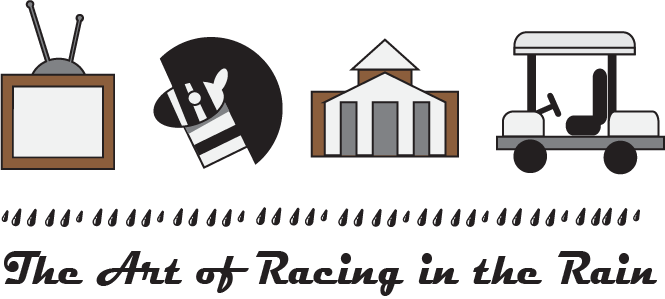 For this activity, I created a type specimen, which is a demonstration of a specific typeface. I choose to use Constantia because I liked the look of its sharp and squared off serifs. I included demonstrations of not only how letters, numbers, and special characters looked in this typeface, but also displayed the main fonts included in it, such as Italic or Bold fonts. I also included some of the history of this typeface from when it was created and later released in 2006. Because this font is a Serif font, I would not use it for anything printed, and therefore, despite this specimen being created in Illustrator, I won't likely use it again due to Illustrator mainly being used for the design of posters, flyers, etc. that will be physically printed. 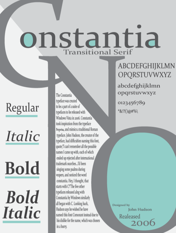 This image was made in Adobe Illustrator, which while similar, had its differences from working with Adobe Photoshop. I found that working in illustrator was easier than in photoshop, though that may be because I am currently using rudimentary tools and techniques, and creating less precise images. I found that working with basic vector graphics was relatively easy, and once I knew what the shape builder tool did, I had no problem understanding what this assignment was teaching me.  I begun this project by watching multiple tutorials on unwrapping UVs, one of which was assigned by my teacher. In this project I enjoyed painting the UV map, which was also the easiest part of this project for me. The hardest part of this assignment for me was making sure that I had painted every section of the model. Because this is a model that I created in the beginning of the year, there are many irregularities and uneven segments that made it easy to miss small slivers of the model that weren't painted the correct color. Through this skill I can now heighten my models, while also having a better understanding of materials in general when modeling. This assignment had me working more in depth with materials and bitmaps. While working on this box I learned to rotate bitmaps, which was something I hadn't previously considered needing to do. In a previous assignment I had been introduced to bitmaps so other than rotation, I feel like I didn't learn a lot from this lesson, but I did enjoy making the asset, and how it looks when it was finished. While I have previously experimented with materials independently, I found that this assignment helped me understand more technical aspects of materials such as bump maps, which I hadn't previously touched. The node interface when working with materials is very nice and allows me to better visualize what I'm doing when working in the material editor. I'm very excited to begin working with materials because of how they will elevate my art and the different paths I can take now. With materials I can go very realistic with my models or more cartoonish, and I'm very excited to be able to add details and patterns that I previously couldn't. https://picryl.com/media/the-complete-aquarium-book-the-care-and-breeding-of-goldfish-and-tropical-fishes-ff6247
This quarter focused purely on 2D digital art, and how to create it using Adobe Photoshop. While I have previously worked with digital drawing programs, I have not had previous experience with Photoshop. I learned how to insert individual images and mask portions of them to remove backgrounds and unneeded objects. I also learned how to use certain modifiers such as blurring and effects like Bevel and Emboss. Throughout this quarter my work, while still basic has become more refined, and I have a better understanding of the different tools at my disposal. In addition to digital art I also went back tp pencil and paper for projects that simply required a rough draft, such as the character design and storyboarding assignments. I find that despite the practice I now have with Photoshop and other drawing programs, I still prefer physical mediums when it comes to drawing. I have also discovered that when it comes to digital art, I much prefer working with 3D objects rather than 2D ones, and I am not considering a career in 2D art like I am with 3D modeling. This project was the culmination of previous projects that built up my ability to create composite images. Beginning this project I came up with multiple concepts. After looking through multiple stock images databases I chose the concept that I believed I could do the most with given the images I had available. I found that finding coherent images and coming up with a solid concept that uses them was more difficult than I thought, having gone through multiple concepts before settling on the scene that I made. While creating this image I used multiple skills that I have learned through out this quarter, such as layer masking to remove backgrounds, and filters such as Gaussian Blur. In addition to this I also used adjustment layers to affect the brightness and contrast of the different elements in this image. I found that the easiest part of this project was the layer masking, because it is something that I have previously learned and practiced in this class. 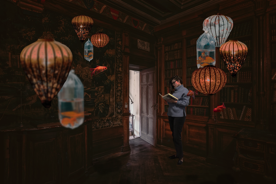 This image was an independent project I made early in the quarter where I experimented with rough creature design. All of the shapes were made by creating an outline using the lasso tool and then filling that outline in, which created abstract shapes with both sharp and rounded edges. I enjoyed this unorthodox way of creating shapes, and decided to add more detail to one the the designs I made, resulting in this piece. 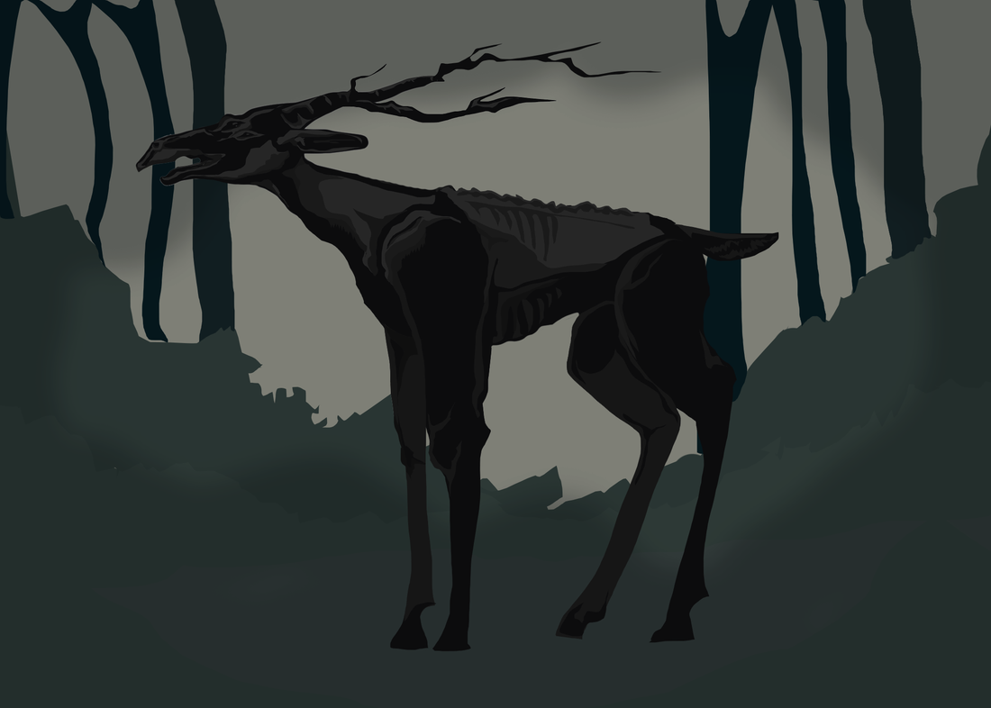 |
